Edit Dashboards
Customize the Dashboard
You can change the dashboard layout, add and rearrange the order of the widgets in columns/rows, add/remove widgets and re-size the columns, rows, widgets etc. In the Reports Name column, click the dashboard name to open the dashboard. The Dashboard page in view mode is initially empty with a default section and row added. The instructions below describe how to enable the edit mode and rearrange your dashboard layout.

Enable Edit Mode on the Dashboard
- Click the Reports tab located on the Umbria landing page, to access the Reports Dashboards. In the Report Name column, click on the dashboard name to open the dashboard. To edit the layout for the Matter dashboard, open the dashboard from the Recent & Favorites page.
- Click the
 icon on the top right corner of the custom dashboard and select the Edit Dashboard option. In case of Matter Dashboard, click the icon at the far right corner of the page below the tabs.
Tip: The user must have the following permission assigned to edit the custom dashboards. Admin: Permission Group: Dashboard > Edit Custom Dashboard
- This enables the dashboard layout builder interface. This is the Edit mode in which you can change the layout of the dashboard and add new widgets, rows, columns, and sections.
-
Click the Preview button to view the edited dashboard layout without saving the changes. To switch to Edit mode, click the Edit button.
- Click Cancel to close the layout editor mode without saving changes.
- Click the Save button to save the layout changes.
-
To view all toolbars available in the Dashboard, click the Pin Editors button. This will pin and display all the toolbars on each editor. Click the button again to unpin and hide the toolbars. The Pin Editor option is also available on each toolbar.
Dashboard Widgets
 Add Widgets to Dashboard
- Enable the Edit mode on the custom dashboard
- Widget can only be added in a cell. Apply the pre-built layout from the Main Toolbar or add a custom layout.
- In the Cell toolbar, click Widget and search for the relevant widget added in the Admin >Widget node.
- In the Section toolbar, click Edit and add the widget details and click Save. Click Preview to view the dashboard without saving the changes.
- Similarly add other widgets to the dashboard. Click Save.
Add Filters to the Dashboard
- Click the Add Filter button to add the page filter widgets created.
- Type the widget name in the search field and click the magnifying glass icon. When you select the widget, further options are displayed.
- Mapped Field:Enter a value in the to connect the filter to the widgets added to the page. This field is useful , if the widgets are built from multiple systems, the value in the mapped field will allow the filter to interact with these widgets.
- Default Value:Enter a default value to appear in the dashboard.
- Use: Select the Generate Filter option to filter the values on the dashboard based on the option selected on the filter, to pass the filter as a parameter (defined variable), select Pass as Parameter.
- Click the Back arrow to return to the search field.
- Type the widget name in the search field and click the magnifying glass icon. When you select the widget, further options are displayed.
- Click the Add Filter button to add the filters on the dashboard page.
- To delete the filter, mouse hover on the filter to display the Delete option. Click Delete.
- To add more filters, click the Add Filter button again. The filters are added in the left to right direction.
Tip: You can also create LookUp filter widgets with display formats. Read here for detailed instructions to create the widget.
Add Cascading Filters to the Dashboard
This option enables you to filter the other dashboard filters based on the value selected in the first filter, i.e. the drop-down values in the child filter will be filtered based on the value selected in the parent filter drop-down.
- Create Lookup widgets. Read here for detailed instructions to create Lookup widgets.
- For e.g. to filter sub-department based on the selected department, create lookup widgets for Department (considered as parent filter) and Sub-Department (considered as child filter).
- Now edit the dashboard and add the filter widgets. First add the parent filter widget i.e. Department Filter , next add the child filter i.e. Sub-Department filter.
Note: The Parent filter must be added to the dashboard first, to enable selection when mapping the child filter with the parent filter.
- In the child filter, in the Mapped Parent Widgetfield, select Department (as the parent filter) and in the Mapped Parent Filter Key enter the parameter name for the Department value, as entered in the Sub-Department widget query. For e.g. in the sub-department query if the value for Department is defined as DeptId, in the Mapped Parent Filter Key field enter DeptId.
- Add the widgets and save the dashboard.
Note: Select Generate Filter option when adding the page filter widgets.
View Filter Cogs on Widgets
The filter cogs on each widget display the global filter(s) applied. To view the filter cogs:
- Select and apply the global filter(s) to the dashboard. The
 icon is displayed on the widgets.
 - Click the icon to view the filter(s) applied to dashboard.
- Clear the page filter(s) to remove the icon.
Change Labels Dynamically on columns
The labels on columns in the widgets can be dynamically changed using tokens within the queries.
The following tokens are supported:
- {currentyear}
- {currentmonth}
- {currentday}
- {currentusername}
- {currentdate}
Set the tokens as columns, and they will populate.
Tokens will be stored in table Caliban.WidgetColumnLabelToken.
Layout Editor Toolbar
You can use the toolbars on the page to add sections, containers, rows, columns, widgets or apply pre-built layouts.
Global Layout Toolbar- Add SideBar and Top Bar To The Dashboard
Mouse hover on the Global Layout ribbon on the top left corner of the page to view the toolbar.
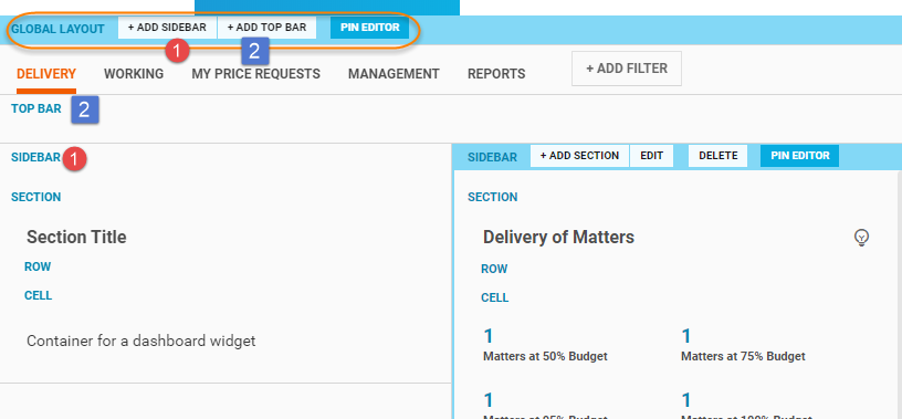
The Global Layout defines the overall structure of the page layout. The Global Layout toolbar includes the following options:
| Button | Description |
|---|---|
| + Add Side Bar | Click to add a side bar on the dashboard page. The panel is added on the left hand side of the page and subsequent panels are added in the left to right direction. To add more than one side bar, click the + Add SideBar button again. |
| + Add Top Bar | Click to add a top bar on the page. |
| Pin Editor | Click to pin the toolbar to the ribbon. To unpin click the button again. |
SideBar Toolbar-Add Section & Navigation Box
Mouse hover on the SideBar ribbon to view the toolbar. The SideBar toolbar includes the following options:
| Button | Description |
|---|---|
| + Add Section | Click to add a section within the sidebar. To add more than one section , click the + Add Section button again. |
| + Add Navigation | Click to add a navigation URL in the side bar. |
| Edit |
Click to change the position and size of the side panel. Position: Select left to place the side bar on the left hand side of the dashboard page or select right to move it to the right hand side of the page. Size: Select the width of the Sidebar from the drop-down. Select Yes or No in the option, to s Collapsible: Select Yes or No to set options to create a collapsible sidebar. |
| Delete |
Click the ellipsis icon Note: Deleting the sidebar will delete all the sections and widgets added in the sidebar. |
| Pin Editor | Click the ellipsis icon  to access this option. Click the Pin Editor button to pin the toolbar to the ribbon. To unpin click the button again. to access this option. Click the Pin Editor button to pin the toolbar to the ribbon. To unpin click the button again. |
Navigation Toolbar-Edit the Navigation URL
Mouse hover on the SideBar ribbon to view the toolbar. The SideBar toolbar includes the following options:
Note: The navigation option is only available in the Global Layout >Sidebar
| Button | Description |
|---|---|
| Edit | Click to add a link. Click +New Link. In the Text field enter the text to displayed for the link. In the URL field, enter the URL to be mapped to the text. Click Add. |
| Delete |
Click to delete the navigation bar. |
| Pin Editor | Click the Pin Editor button to pin the toolbar to the ribbon. To unpin click the button again. |
Side Bar Navigation supports:
- Absolute links: In the Text field, enter the text to be displayed in the UI and in the URL field enter an absolute link for redirection to the external page (e.g. https://www.prosperoware.com)
- Relative links: In the Text field, enter the text to be displayed in the UI and in the URL field enter add a relative link for redirection to the page (e.g. you can add a relative link to redirect to another dashboard /WidgetPage/1234/LoadWidgetPage?dashboardId=11)
- In page navigation: In the Text field, enter the text to be displayed in the UI and in the URL field enter the section ID. Add # before the section ID. For e.g. if the section id is 'section1' , enter it as #section1 in the URL field.
TopBar Toolbar- Add Widget Containers & Filters on TopBar
Mouse hover on the TopBar ribbon to view the toolbar. The TopBar toolbar includes the following options:
| Button | Description |
|---|---|
| + Add Container | Click to add a plain container to hold the dashboard sections. To add more than one container , click the + Add Container button again. |
| + Add Filter | Click to add the filter widgets. Type the widget name in the search field and click the magnifying glass icon. When you select the widget, further options are displayed. Enter Mapped Field. In the drop-down for Use, select the option to add the filter as a parameter or generate filter. Click the Back button to display the widget list. |
| Delete |
Click to delete the top bar. Note: Deleting the top bar will delete all the containers and widgets added in the top bar. |
| Pin Editor | Click the Pin Editor button to pin the toolbar to the ribbon. To unpin click the button again. |
Main Toolbar- Add Rows, Columns, or Apply Pre-built Layouts
Mouse hover on the TopBar ribbon in the center of the page to view the toolbar. The Main toolbar includes the following options:
| Button | Description |
|---|---|
| Columns |
Select the Columns button and click + to add a plain container as a column to hold the dashboard sections. To add more than one container , select Columns and click + again. The containers are added as columns within the main section in the left to right direction. |
| Rows |
Select the Rows button and click + to add a plain container as a row to hold the dashboard sections. To add more than one container , select Rows and click + again. The containers are added as rows within the main section in the left to right direction. Note: If the main section already has containers added as rows, the new rows are added below the containers at the bottom of the page. |
| Main Scroll |
Click to apply main scroll if your dashboard has one single page without sections. It will be added as a single page scroll navigation. |
| Sections Scroll | Click to apply the sections scroll if the main section is further divided into sub-sections and containers. This option will add the scroll navigation on each of the section and containers. |
| Apply Layout | Click to apply pre-built layout on the dashboard page. There are 3 options available. Select the option to auto apply the layout. |
| Pin Editor | Click the Pin Editor button to pin the toolbar to the ribbon. To unpin click the button again. |
Section Toolbar-Edit Section Layout
Mouse hover on the Section ribbon to view the toolbar. The section toolbar includes the following options:
| Button | Description |
|---|---|
| Edit |
Click to Edit the section details. Click Save to apply the changes.
|
| + Add Row |
Click to add a row within the section. To add more than one container , click the + Add Row button again. |
| + Add Tab |
Click to add a tab in the section. To add more than one tab, click the +Add Tab button again. |
| Switch to Container | Click to switch the section mode to a plain container. |
| Delete |
Click to delete the section. Note: Deleting the section will delete all the rows, tabs, and containers added in the section. |
| Pin Editor | Click the Pin Editor button to pin the toolbar to the ribbon. To unpin click the button again. |
Container Toolbar-Edit Container Layout
Mouse hover on the Container ribbon to view the toobar. The Container toolbar includes the following options:
| Button | Description |
|---|---|
| Columns |
Select the Columns button and click + to add a plain container as a column to hold the dashboard sections. To add more than one container , select Columns and click + again. The containers are added as columns within the main section in the left to right direction. |
| Rows |
Select the Rows button and click + to add a plain container as a row to hold the dashboard sections. To add more than one container , select Rows and click + again. The containers are added as rows within the main section in the left to right direction. Note: If the main section already has containers added as rows, the new rows are added below the containers at the bottom of the page. |
| Switch to Section |
Select to switch the container mode back to section. Note: This option is displayed if the section mode is switched to container. |
| Delete |
Click to delete the container. Note: Deleting the container will delete all the columns, rows added in the container. |
| Pin Editor | Click the Pin Editor button to pin the toolbar to the ribbon. To unpin click the button again. |
Row Toolbar-Edit Row Layout
Mouse hover on the Row ribbon to view the toolbar. The row toolbar includes the following options:
| Button | Description |
|---|---|
| + Add Cell |
Click to add a container cell within the row. To add more than one container , click the + Add Cell button again. The cells are added as columns within the rows. |
| Delete |
Click to delete the row. Note: Deleting the row will delete all the cells and widgets added in the row. |
| Pin Editor | Click the Pin Editor button to pin the toolbar to the ribbon. To unpin click the button again. |
Cell Toolbar-Add/Replace Widgets, Edit Filters, & Add Tabs
Mouse hover on the Cell ribbon to view the toolbar. The cell toolbar includes the following options:
| Button | Description |
|---|---|
| + Add Widget |
Click to add a widget. Type the widget name in the search field and click the magnifying glass icon. |
| Replace Widget | Click to replace the widget. Type the widget name in the search field and click the magnifying glass icon. |
| Connections |
Click to connect filters with the widgets used in the dashboard. Read here for detailed instructions to set connection filters. |
| Edit |
Click to edit the cell details. Click Save to apply the changes.
|
| + Add Tab | Click to add a tab within the cell. To add more than one tab, click the +Add Tab button again. |
| Delete |
Click to delete the cell. Note: Deleting the cell will delete all the widgets and tabs added in the cell. |
| Pin Editor | Click the Pin Editor button to pin the toolbar to the ribbon. To unpin click the button again. |
Reorganize Dashboard
Connect Dashboard Filters To Widgets
- Enable the Edit mode in the dashboard.
-
Select the widget you want to connect the filter with and in the cell toolbar click Connections .
-
In the pop-up dialog, two options are displayed, Filters & Filter Widgets.
- Filters: This displays a list of all the global page filters applied on the dashboard. Here, you can select the filter to be connected with the widget in the cell.
- Filter Widgets: This displays a list of all the widgets used in the dashboard. Here, you can map one widget with another widget used in the dashboard.
- Select the Filter or Filter Widget, enter the following information in the next pop-up dialog displayed:
- Mapping Field: Enter the name of the field to be mapped (with the stats and analytics cubes) so it can interact with the filter widget
Default Value: Enter a default value to appear on the dashboard.
Use: Select the Generate Filter option to filter the values on the dashboard based on the option selected on the filter, to pass the filter as a parameter (defined variable), select Pass as Parameter.
- Filter Widget Field: Displayed if Filter Widgets selected. The widget data field is populated by default.
- Click Connect.The widget is connected to the applied filter and the widget data can now be filtered based on the value selected in the applied filter.
Re-arrange Widgets on Dashboard
- Click on the Reports tab to access the Dashboard. In the Report Name column, click on the dashboard name to open the dashboard.
- Click the icon on the top right corner of the Dashboard and select the Edit Dashboard option.
- Drag and drop the cell containing the widget into an empty cell.
- If you drag a cell containing the widget into a container that already has a widget, the container is split to hold two widgets. Each cell container will have a scroll bar.
- To re-arrange multiple widgets from top to bottom position or vice versa, mouse hover on the Container toolbar and drag the cell containers.
Re-size Widgets on Dashboard
- Click on the Reports tab to access the Dashboard. In the Report Name column, click on the dashboard name to open the dashboard.
- Click the icon on the top right corner of the Dashboard and select the Edit Dashboard option.
- Drag the cell containers to right or left to re-size the widgets.
Print the Dashboard report to PDF
- Click on the Reports tab to access the Dashboard. In the Report Name column, click on the dashboard name to open the dashboard.
- Click the icon on the top right corner of the Dashboard. Select Screenshot to PDF to print the dashboard to a PDF document.
Add Drill Through Dashboard
- In Admin Panel>Widget Drill Type add and save a drill through page.
- Select the widget where you want the drill through option to be placed. Edit the widget, in the Widget Additional Config node add the drill through configuration.
- In the Dashboard > Reports tab select the Dashboard where the widget is applied. Select the widget and mouse hover or right click on the chart values to display the drill through options. Click to access the drill through information.
Tip: Single click drill through reports can also be configured at the Grid widget column level. Read here for detailed instructions to add Grid widgets and configure single click drill through from grid columns.
Apply Source Dashboard Filter(s) to the Target Drill Through Dashboard
This option allows you to drill down and filter the information in the target dashboard as per the page filters applied in the source dashboard. For e.g. If the data in the source dashboard is filtered by a specific office filter then the data in the target dashboard will also be filtered by that specific office filter. Filters applied in the first dashboard will be mapped to the second dashboard when drilling through.
- Select the source dashboard and the target dashboard (to add as a drill through page).
Note: Both the dashboards must have the same global page filters applied. (For e.g. Period, Office, & Department)
- Now add the target dashboard as a drill through page in the Admin>Widget Drill Type node.
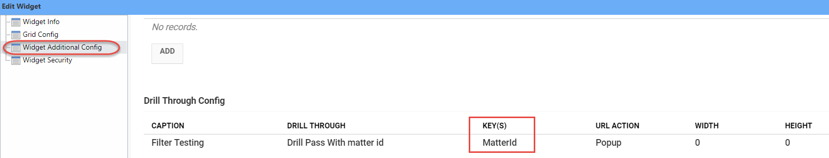
- If the source and the target dashboards filters are mapped with the same key (image 2) add the complete target drill through dashboard page URL.
For e.g. https://yourtenant.prosperoware.io/WidgetPage/5474/LoadWidgetPage?dashboardId=147
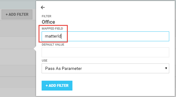
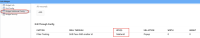
- If the source and the target dashboards filters are not mapped with the same key then add the complete target dashboard page URL and at the end of this URL add the mapping field applied to the target page filter (image 1). For e.g. If the filter on the target page is mapped with matterId (image 2), this parameter must be added at the end of the drill through dashboard URL, https://yourtenant.prosperoware.io/WidgetPage/5474/LoadWidgetPage?dashboardId=147&matterId={0} Click Save.
image 1
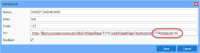
image 2 
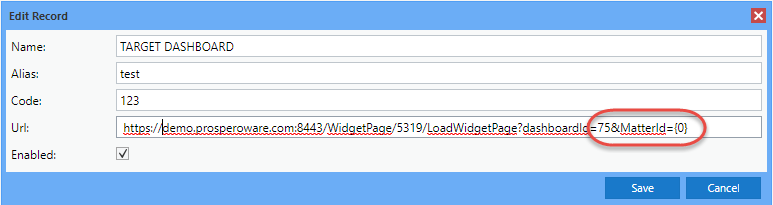
Note: The mapped field in the filters from the source dashboard to the target dashboard is passed as a parameter. This parameter must be defined in the target page widget query.
- In the Admin>Widget node edit the source dashboard widget to add the drill through configuration. In the Widget Additional Config>Drill Through Config in the field for Key(s) enter the mapped parameter. Click Save.
- To map the drill through to dashboards on the machine:
- In the Reports tab open the source dashboard and filter the dashboard information. Now drill through from the widget to the target dashboard. The data in the target dashboard is also filtered as per the source dashboard filter applied.
General Instructions
- A Top bar, Side bar, and Navigation pane can only be added from the Global Layout toolbar.
- A container or section must be added from the Global Layout toolbar or the Main toolbar to proceed to add widgets.
- Widget can only be added in a cell. You can only add one widget in a cell. A Cell can only be added in a Row within a Section. To add a cell, you must add a Container and switch to Section or add a Section.
- A Section layout can be switched to a Container layout and vice versa.
- Pre-built layouts can be applied to the Dashboard page from the Main toolbar.
- Sections and Containers can be moved or re-sized in Edit and Preview mode, however you cannot add rows, sections, columns, or widgets in the Preview mode.
- Deleting containers and sections will also delete all the rows, columns, and widgets nested under it.
- Enable Global Settings>Modules>Debug mode to enable the Application log to capture any updates to the Dashboard and assist in troubleshooting.